My choices were Kerrang and NME, this was because I found Kerrang had the most interesting front cover for its music magazine and NME displayed a very popular model on the front page who I personally admire myself.
I then looked at examples of double page spreads:
I chose to look at double page spreads as I needed some more aspiration and ideas for my own music magazine design. These three existing double page spreads gave me some more ideas to use for my personal music magazine design.
The artists present on these double page spreads are extremely popular with the public, and are well recognised this would make the magazine they were involved in more popular, and the addition of the magazine would become even more popular. I chose these three magazines to analyse because I was very familiar with these music artists and thought that the double page spreads were the most attractive.
I liked all the layouts of these, however I thought that the middle double page spread had the image to large so there wasn't much text or information present. However this made the individual more attractive as people would prefer to read less text and look at the pictures involved in the magazine.
The music magazines double page spread that involved the artist Lily Allen, it illustrates a quote that was spoken from Lily Allen herself, which would make the reader of this particular magazine more interested in reading what the artist has to say.
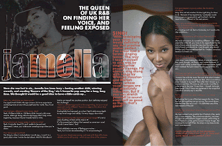
The bottom double page spead which shows an image of the artist Jamelia is my favourite of all the three double page spreads. The reason for this is because it contains a background of images of her, however the technique that has been used makes the text over lap the pictures which I personally think has a very good effect and makes the reader more attracted to reading this magazine.


No comments:
Post a Comment