Thursday 23 February 2012

Evaluation of Media Coursework

My Media product uses forms and conventions of real media products as it shares the same layout as many different music magazines that I looked at during my research. I also received many of my ideas from music magazines I found in my research and this helped me to design my front cover, contents page and my double page spread. From looking at a variety of music magazines I could choose the particular theme that I wanted to include in my research; however I was able to receive many ideas from my questionnaire and my target audience. On my front page I knew what to advertise for the magazine and this guided me into what to feature onto the contents page. This then led me to using an interview on my double page spread for my chosen model.
My media product represents particular social groups as the whole design is about the chosen instrument of a piano. This could have a bigger influence on musicians and people that are interested in playing the piano. My music magazine may also represent young teenagers as the model is a young teenager.
The media institution that would be most suitable for my product would be anything to do with music; however the type of music would have to be for a particular instrument such as the piano. This is because my magazine is evolved around the main subject of a piano.
The audience for my product would be teenagers due to the young model and anyone who is interested in piano’s and instruments. I attracted my audience by first of all creating a questionnaire to make sure that what I was planning on doing was going to attract my target audience. I also make sure that I used a young teenager as my model to aim my music magazine at a younger audience. I made the magazine colourful, however I still stuck to one main theme which consisted of red, white and black and my model matched these colours as well which was extremely successful.
By making and planning this product I learnt about different programmes I could use to make my music magazine designs. I found different programmes to edit my photos that I had taken for my designs and I used the internet to research and the website ‘blogger’ to present all my work on.
During the process of creating my product I learnt the different types of programmes I could use, the different angles of camera shots I could use to make my designs look more effective that the basic shots that could have been used. I learnt how to edit my product and how to improve throughout the making of my magazine designs. 

Monday 6 February 2012

Designing and Editing my Front Page:

This was the original design for my front page, however my photos were not added/present. I tried to deisgn my front page with teh colour scheme of pink, black, grey and white but I did not think the colour 'pink' was working. I then decided to change this to red. I also recieved feedback that the new colour scheme was improved and overall a much better decision during my editing.


I then decided that my music magazine front page did not look as attractive when the colour scheme included pink. So I decided to change the main colour to red, I thought that this made it look more like a music magazine, to make my decision I also asked members of my target audience who agreed with me, this is how I made my final decision and changed the main colour to red.
I have been constantly changing the layout around to see which layout would work best with the music magazine front page. However I can guarantee that I will continue to edit the layout as I start to add my photographs onto my music magazine.

 However, when I added my picture to my front page I knew it needed a few changes so I deleted a few items and move the bar code to the top of the page to make the page look more attractive. I wanted the piano at the bottom to stand out so I made sure that there was no text towards the bottom of the page and started to write my text at the top, each side of the model.


My finished front page:
I was pleased with my final design for my front page. After lots of editing I finally pleased with the outcome and adding the picture made me change many of my ideas due to the particular layout and organisation of my front page. I was happy with the colour scheme as my model matched this due to the clothing, hair colour and lipstick she wore for the pictures.


Designing and Editing my Contents page:
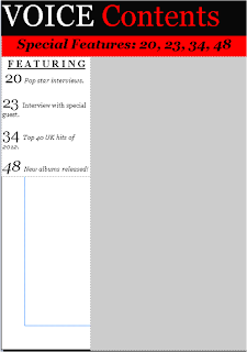
This was the basic layout which I chose for my contents page, I wanted to make sure I covered the whole of the page with either text or pictures, this is why I chose to also add backgrounds to make sure that I had as much colour as possible present on the page.
I made my main colours to match my front page, red, white, black and grey. I felt these colours went together and due to my questionnaire I needed to keep the same colour scheme throughout my music magazine.

After knowing what my basic layout was going to contain, I then started to add more onto my contents page. I added the 'Special Features' so it made the music magazine more unique aswell as important, only showing the main parts of the music magazine in which my target audience would want to see.
I made the page number bigger than the text, this made it look more attractive. Analysing this and also recieving other peoples views who are members of my target audience, I will edit this contents even more and I might change the colour of the bigger numbers, I think that this will work as it would make the text next to the numbers even more eye catching and overall the magazine more colourful. If this does not work I will keep them black.

My next step was to add more eye catching information onto my contents page, I knew that I had to add these certain aspects onto my contents page as this is the page that my target audience would recieve their information from and want to view to see what is inside the magazine. I added a star shape which contained information to illustrate to my target audience that there is a competition inside the music magazine. The star matched my colour scheme and I chose to use white writing on top of the star to stand out.
The background behind the star, I chose to fill in red. I was going to keep this background white, however I thought that it looked too basic so I decided to make it match my colour scheme and this way it looked more attractive.


This was my final design before I added my picture. For this I made some changes for this specific design. I moved the writing on the star over to the left of the page to make sure the white writing was more eye catching as the writing indicated and was showing a competition inside the magazine. I added some more text and gave more information on some of the pages which will be included in my magazine.

My final contents page: 
The outcome of my contents page was successful as I included all the information that was needed and the main source of the magazine which was on page 49. When I added my picture I thought my contents page looked complete and I also added some text on the photo to show what it was trying to show. 

Designing and Editing my Double Page Spread: 


This was the basic layout that I chose for my double page spread, from working on my front page and contents page I gained many ideas to use for my double page spread and I knew that I was going to include an interview on my double page spread so I could begin to think of questions to ask  and answers to use.

I was pleased with the final design of my double page spread. I was happy with the colour scheme as throughout my designs including front page and contents page, the theme followed throughout. The red, black and white worked well together and I felt like these were colours that extremely would be present in a modern day music magazine. The colours also worked well together with the particular outfit I chose my model to wear. I chose to add four pictures onto my double page spread to highlight the different camera shots I used and to show all my pictures present. My questionnaire also required me adding more pictures than text and I wanted to make sure my target audience got what they wanted to see. I included an interview as I personally thought this would highlight why I chose to use a piano in my pictures and the reason behind the model used. The name 'Jasmin Cook' also reminded me of a type of music due to 'Jazz music' so I thought this models name was completely relevant.

Friday 13 January 2012

Planning:


I will take at least 3 or 4 pictures to use in my music magazine. These will consist of:
- Long shot
- Meduim close up shot
- High shot


I will aim to take my pictures of 1 or 2 different people.
For my music magazine, my models will be girls.


On my double spread, I will include quite a lot of text to show that my magazine is detailed and I have researched which type of information to include in my music magazine. However I will make sure that this information is relevant to my pictures and matches the theme of my magazine.

Changes:

After analysing the results of my questionnaire I have a few changes to my music magazine.

I have decided to take at least 4 - 5 pictures of only one chosen model. However the model I am going to use will still be a girl.

I will vary the types of shots that I am going to use for my music magazine to make the magazine look more attractive and eye catching.

Things I am going to consider and include due to my results:

- The text presented will be meduim
- The colour scheme will be black/grey/pink. The only reason I did not chose to use the most popular option:red is because the model I planned to originally going to take my pictures of was not able to be present.
- There will not be a theme for my music magazine
- The music magazine will be out every month
- The model is a single artist
- The makeup my model will wear is going to be dark
- There will be a set colour for my music magazine
- The same model will be present the whole way through the magazine
- There will be a mixture of content and pictures
- The name of my music magazine will be 'Voice'

Thursday 8 December 2011

Planning and designing my music magazine

I done a questionaire with 10 questions to ask my target audience. I used some of the questions from my recent questionaire which was used for my previous designs which I personally thought would help me in drawing my results to a full conclusion.
My target audience: Teenage girls between the ages of 14-18.


1. How big would you like the font:
- Small
- Medium
- Large
- Extra large


2. What colour would you prefer for the magazine?
Pink
-  Purple
Blue
-  Green
-  Black/grey
-  Red


3. What theme would you prefer for the magazine?
Summer
Winter
Autumn              
-  Spring
-  No theme
4. Would you like an update of this particular magazine:
-  Every week
-  Every month
-  During the seasons throughout the school year


5. Would you like a single artist or a band shown on the magazine:
- Single
- Band


6. What sorts of eye makeup would you like to see on the model/models?
- Not much - natural
- Small amount applied
- Dark


7. What colour clothes would you like to see on the model/models?
- Mixed
- One set colour
- Similar colours


8. Do you want the same model/models for the whole of the magazine?
-  Yes
-  No


9. How much information would you prefer on the double page spread?
- Full of context - pages completely filled
- Not much, more pictures would be preferred
- Small amount - barely any


10. What title would you like to see on the front page of the magazine?
- Tone
- Beat
- Voice


Results:

1. How big would you like the font?

From this i can see that there was a much higher number of participants in my target group that wanted the text in my music magazine to be medium. This helped me make the decision to make the text present not to big but not too small. This would make it easy and comfortable for my target audience to read my music magazine.


2. What colour would you prefer for the magazine?


This pie chart shows me that the most popular colours were between pink, black and red. Red and black showed the highest amount of votes, so this persuaded me to choose the main colours for my music magazine to be red and black. I decided to use the colours to match the pictures that I will take and the text. My single artist model will be wearing a red dress and heels and I will make sure that the pictures and text match each other. I have chosen the text to be mainly black and bold to make it stand out, with red coloured titles to make the music magazine look more attractive, interesting and eye catching.


3. What theme would you prefer for the magazine?

These results showed me that my target audience did not want to see a particular theme in the magazine that I am going to create. I preferred this as it gave me a wider range of options to choose from and I could decide personally myself. However I still gathered information from my target audience about what they wanted to see in the magazine. This gave me more knowledge about what they wanted to see, but I could decide personally myself.

4. Would you like an update of this particular magazine?
I also wanted to find out how often my target audience wanted to see a new addition of the new magazine. The most popular option was every month which illustrated positive choices, as this would give more time to work on what to add into the new addition of the magazine.

5. Would you like a single artist or a band shown on the magazine?

When I asked this certain question, the results showed me that my target audience wanted to see a single artist in the music magazine. In my music magazine I will use a model to represent a single artist as this is what my target audience want to see. This will make my music magazine even more popular and make the target market want to buy it. I also gained certain advise from my target audience as I asked what they wanted to see the single artist wearing/doing/where the pictures would be taken. Even though I did not include this information in my questionaire, I will include it when I take my pictures. Next time I will make sure that I write a longer questionaire including different and a wider range of questions.

6. What sorts of eye makeup would you like to see on the model/models?

The results for this question showed me that my target audience wanted to see my single artist model wearing dark makeup. This would benefit me while I take the pictures as I would be able to match the models outfit with the particular makeup that she is wearing. Also I can match the background scenery and the titles/text that I will present on all the pages.

7. What colour clothes would you like to see on the model/models?

I found out from my questionaire that people in my target audience would prefer to see one set colour for the whole of my music magazine. I was very pleased with these results as I could match all the colours together in my music magazine, knowing that this is what my target audience would want to see. This helped me alot as I knew that I could put my personal ideas towards my music magazine aswell as making my target audience.

8. Do you want the same model/models for the whole of the magazine?
 When I asked my target audience if they wanted to see the same model the whole way throughout my music magazine, more than three quarters of them voted 'yes' which showed me that my target audience want to see the same model throughout my music magazine.
I was extremely happy with these results because whilst I was planning my questionnaire I personally wanted to use the same model the whole way through, as I personally viewed this would make the magazine more unique.

9. How much information would you prefer on the double page spread?

This piece of feedback was extremely helpful to me as I needed to know how much content to include on my double page spread. My target audience chose that they wanted to view a small amount of content. This led me to planning to take more pictures for my target audience to view on my music magazine pages.

10. What title would you like to see on the front page of the magazine?


Overall on this particular question I was worried that it would be difficult to choose a certain title for my music magazine. This was because I found it hard to come up with a few names to include in my questionnaire. However the results showed me that the most popular option was 'Voice' and this was my personal favourite. I was happy with this final decision.

I chose two types of magazines out of the four that I originally displayed as examples. I researched these two magazines and found two different magazine front covers to analyse which I found the most interesting.


My choices were Kerrang and NME, this was because I found Kerrang had the most interesting front cover for its music magazine and NME displayed a very popular model on the front page who I personally admire myself.


I then looked at examples of double page spreads:


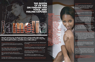
I chose to look at double page spreads as I needed some more aspiration and ideas for my own music magazine design. These three existing double page spreads gave me some more ideas to use for my personal music magazine design.
The artists present on these double page spreads are extremely popular with the public, and are well recognised this would make the magazine they were involved in more popular, and the addition of the magazine would become even more popular. I chose these three magazines to analyse because I was very familiar with these music artists and thought that the double page spreads were the most attractive.
I liked all the layouts of these, however I thought that the middle double page spread had the image to large so there wasn't much text or information present. However this made the individual more attractive as people would prefer to read less text and look at the pictures involved in the magazine.
The music magazines double page spread that involved the artist Lily Allen, it illustrates a quote that was spoken from Lily Allen herself, which would make the reader of this particular magazine more interested in reading what the artist has to say.
The bottom double page spead which shows an image of the artist Jamelia is my favourite of all the three double page spreads. The reason for this is because it contains a background of images of her, however the technique that has been used makes the text over lap the pictures which I personally think has a very good effect and makes the reader more attracted to reading this magazine.